Overlaying species occurrence data with climate data
One of the goals of the rOpenSci is to facilitate interoperability between different data sources around web with our tools. We can achieve this by providing functionality within our packages that converts data coming down via web APIs in one format (often a provider specific schema) into a standard format. The new version of rWBclimate that we just posted to CRAN does just that. In an earlier post I wrote about how users could combine data from both rgbif and rWBclimate. Back then I just thought it was pretty cool that you could overlay the points on a nice climate map. Now we’ve come a long way, with the development of an easier to use and more comprehensive package for accessing species occurrence data, spocc, and added conversion functions to create spatial objects out of both climate data maps, and species occurrence data. The result is that you can grab data from both sources, and then extract climate information about your species occurrence data.
In the example below I’m going to download climate data at the basin level for the US and Mexico, and then species occurrences for eight different tree species. I’ll then extract the temperature from each point data with an spatial overlay and look at the distribution of temperatures for each species. Furthermore the conversion to spatial objects functions will allow you to use our data with any shape files you might have.
The first step is to grab the KML files for each river basin making up the US and Mexico, which we identify with an integer.
library("rWBclimate")
# Install spocc from our GitHub repo
# devtools::install_github("spocc", "ropensci")
library("spocc")
library("taxize")
library("plyr")
library("sp")
library(spocc)
### Create path to store kml's
dir.create("~/kmltmp")
options(kmlpath = "~/kmltmp")
options(stringsAsFactors = FALSE)

usmex <- c(273:284, 328:365)
### Download KML's and read them in.
usmex.basin <- create_map_df(usmex)
## Download temperature data
temp.dat <- get_historical_temp(usmex, "decade")
temp.dat <- subset(temp.dat, temp.dat$year == 2000)


# Bind temperature data to map data frame

usmex.map.df <- climate_map(usmex.basin, temp.dat, return_map = F)
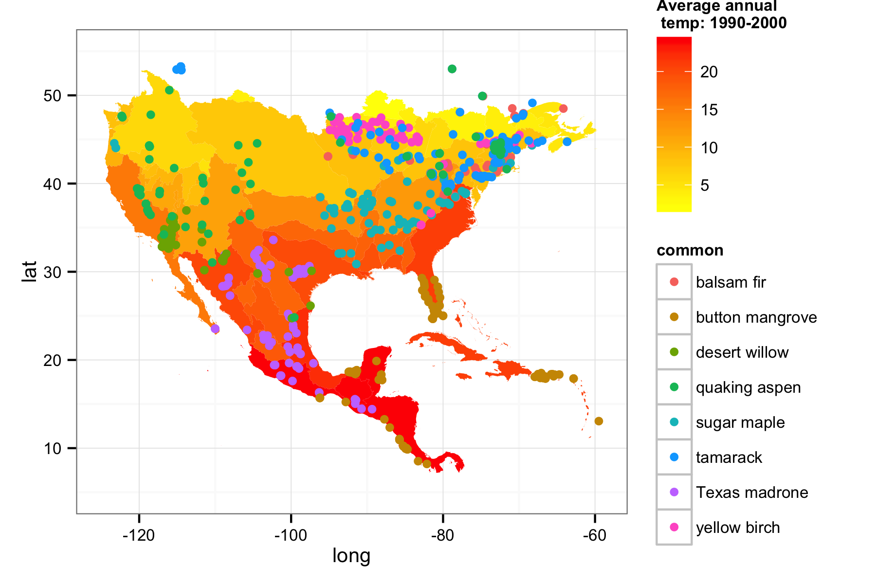
Now we have created a map of the US and Mexico, downloaded the average temperature in each basin between 1990 and 2000, and bound them together. Next let’s grab occurrence data using spocc for our eight tree species (Note: rgbif > 0.6.0 needs to be installed to work properly)
## Grab some species occurrence data for the 8 tree species.

splist <- c("Acer saccharum", "Abies balsamea", "Arbutus xalapensis", "Betula alleghaniensis", "Chilopsis linearis", "Conocarpus erectus", "Populus tremuloides", "Larix laricina")

## get data from bison and gbif
splist <- sort(splist)
out <- occ(query = splist, from = c("bison", "gbif"), limit = 100)

## scrub names
out <- fixnames(out, how = "query")

## Create a data frame of all data.

out_df <- occ2df(out)
Now we’ve downloaded the data using their latin names, we might want to know the common names. Luckily the taxize package is great for that, and we can grab them with just a couple of lines of code.
### grab common names
cname <- ldply(sci2comm(get_tsn(splist), db = "itis", simplify = TRUE), function(x) { return(x[1]) })[, 2]
### Now let's create a vector of common names for easy plotting But first
### order on names so we can just add the names
out_df <- out_df[order(out_df$name), ]
### strip NA values and 0 values of coordinates
out_df <- out_df[!is.na(out_df$lat), ]
out_df <- out_df[out_df$lat > 0, ]
out_df$common <- rep(cname, table(out_df$name))
Now we have all the components we need, species data and spatial polygons with temperature data bound to them. Before we do the spatial over lay, let’s have do a quick visualization.
## Now just create the base temperature map
usmex.map <- ggplot() +
  geom_polygon(data = usmex.map.df, aes(x = long, y = lat, group = group, fill = data, alpha = 0.9)) +
  scale_fill_continuous("Average annual \n temp: 1990-2000", low = "yellow", high = "red") +
  guides(alpha = F) +
  theme_bw(10)

## And overlay of gbif data
usmex.map <- usmex.map +
  geom_point(data = out_df, aes(y = latitude, x = longitude, group = common, colour = common)) +
  xlim(-125, -59) +
  ylim(5, 55)

print(usmex.map)

Now the question is, what’s the temperature at each point for each tree species? We can convert our species data to spatial points with occ_to_sp, and our data from rWBclimate can be converted to spatial polygons with kml_to_sp. Next we can loop through each grouping of species, and call the over function to get the temperature at each point.
## Create a spatial polygon dataframe binding kml polygons to temperature
## data
temp_sdf <- kml_to_sp(usmex.basin, df = temp.dat)
### Now we can change the points to a spatial polygon:
sp_points <- occ_to_sp(out)

tdat <- vector()
### Get averages
for (i in 1:length(splist)) {
    tmp_sp <- sp_points[which(sp_points$name == splist[i]), ]
    tmp_t <- over(tmp_sp, temp_sdf)$data
    tdat <- c(tdat, tmp_t)
}
The last step is to create a new data frame with our data. Unfortunately the size of our old data frame out_df won’t be the same size due to some invalid lat/long’s that came down with our data so the entire data frame will be reassembled. After we assemble the data frame we can summarize our it with plyr, getting the mean temperature and latitude for each species.
### Assemble new dataframe
spDF <- data.frame(matrix(nrow = dim(sp_points)[1], ncol = 0))
spDF$species <- sp_points$name
spDF <- cbind(coordinates(sp_points), spDF)

### This is important, be sure to order all the points alphebetically as we
### did earlier
spDF <- spDF[order(spDF$species), ]

spDF$cname <- rep(cname, table(sp_points$name))
spDF$temp <- tdat
### Strip NA's
spDF <- spDF[!is.na(spDF$temp), ]

## Create summary
summary_data <- ddply(spDF, .(cname), summarise, mlat = mean(latitude), mtemp = mean(temp),
    sdlat = sd(latitude), sdtemp = sd(temp))
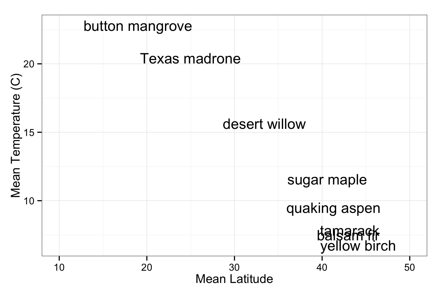
First let’s look at a plot of mean temperature vs latititude, and to identify the points we’ll plot their common names.
ggplot(summary_data, aes(x = mlat, y = mtemp, label = cname)) +
  geom_text() +
  xlab("Mean Latitude") +
  ylab("Mean Temperature (C)") +
  theme_bw() +
  xlim(10, 50)

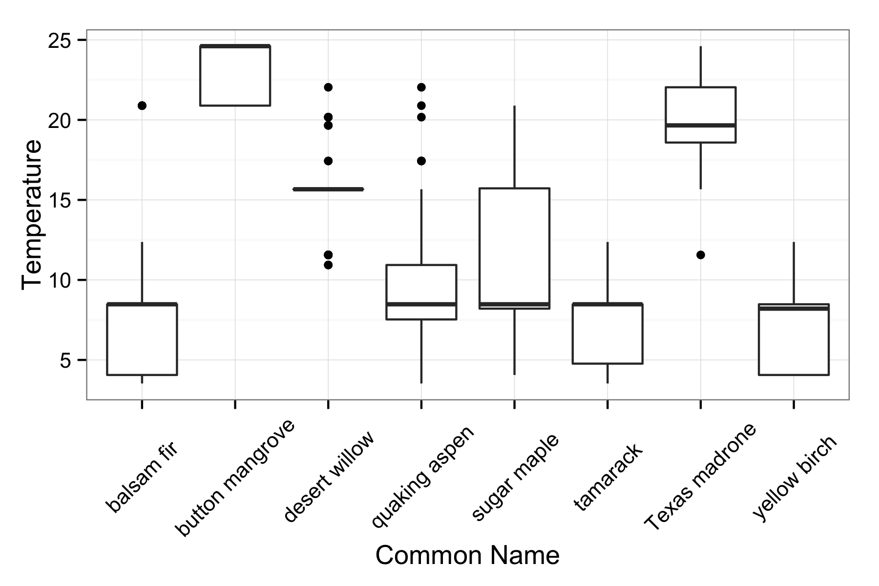
This gives us a sense about how the means of each value are related, but we can also look at the distribution of temperatures with boxplots.
ggplot(spDF, aes(as.factor(cname), temp)) +
  geom_boxplot() +
  theme_bw(13) +
  ylab("Temperature") +
  xlab("Common Name") +
  theme(axis.text.x = element_text(angle = 45, hjust = 0.5, vjust = 0.5))

This gives a sense of how wide the temperature distributions are, as well as looking at some of the outliers. The distributions look pretty skewed, and this probably reflects the large spatial granularity of our temperature data compared to the occurrence data. However this example shows how you can easily combine data from multiple rOpenSci packages. We will continue to work towards enhancing the interoperability of heterogeneous data streams via our tools.
